The brief was about redesign a cover book that we had read before. So, I choose a book called “The Arabs from a Japanese perspective”. I started thinking and analyzing for solution design and brainstorming how to build a relationship with the reader from the first look.
As my audience are literate people, they don’t like to see many items in the cover. They care more about purport of the book and its title. Therefore, I build my concept idea to translate the book title into visual language.
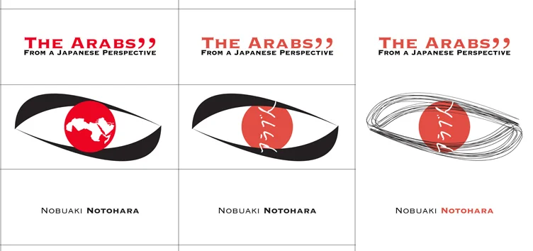
I used single visual layout to make more emphasis on this element as a focal point. Also, I used the rule of third for my design composition and I divided the page into horizontal thirds to create breathing room for the elements. Then I started doing some thumbnail and rough for the visual element. I decided to draw an eye (infer their perspective) with red pupil (infer a Japanese identity). After that, I started thinking about draw shape of the eye, I liked to create a unique style. So, I did gesture lines for the eye outline to add movement and rhythm to the design.
During work on my thumbnail, I put arab countries map inside this eye to infer the book topic, but I felt it was deviate from my design harmony. I tried to fix it many times until I used “Arab” word by Japanese language which made it simple and contrast with the design. Regarding to the colours, I changed the red value to produce tint that could absorbs some energy and powerful of red. I decided to support the red with pure black and white background to make high contrast to be simple and smart.


